People are struggling more than ever with stress, anxiety, sleep deprivation, mental fog, etc. and they’re looking for holistic solutions to solve these problems. Both Wyatt and David from Birch noticed this worrying trend and thought they could do something about it.
Rooted in science and inspired by nature, Birch aims to leverage technology to infuse our everyday lives with the benefits of nature. Their first product set to launch in late 2024 is a smart diffuser which plugs directly into an outlet and, based on your custom settings in the app, will fill your home with your scent of choice. With mess-free scent swapping, automated diffusing routines, oil tracking, and more, Birch needed an identity that helped to position them as true innovators and future market leaders of the aromatherapy industry.


As part of the brief questionnaire I provide my clients, I ask them to provide any considerations that should be weighed up before starting my design process. The team at Birch highlighted that the final design would be engraved on the diffuser and feature proudly on the app icon. Having this information at the beginning was a godsend. It meant that I could save a bunch of time not needing to explore routes that wouldn’t tick both boxes.
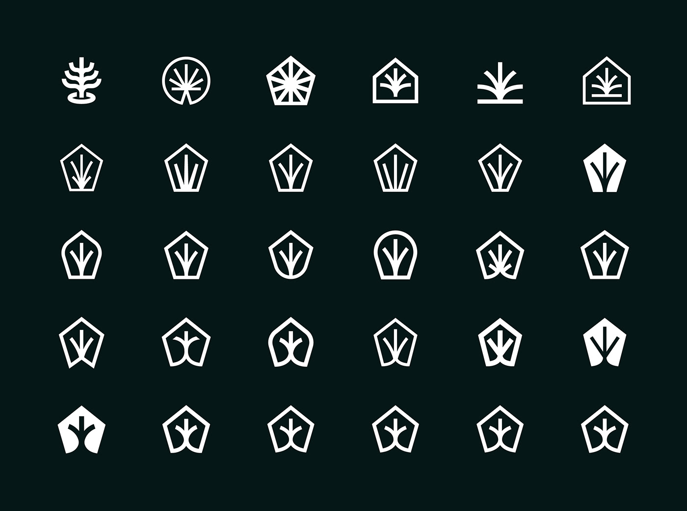
After conducting my market research, I found that most of Birch’s direct competitors’ identities heroed a customised typeface (otherwise known as a logotype or wordmark) as their logo. Given the aforementioned considerations in the brief and the stylistic saturation of the market, I thought this was a prime opportunity to zag. This meant the idea of creating a symbol/icon (or logomark) for Birch started sneaking in the back door of my mind.
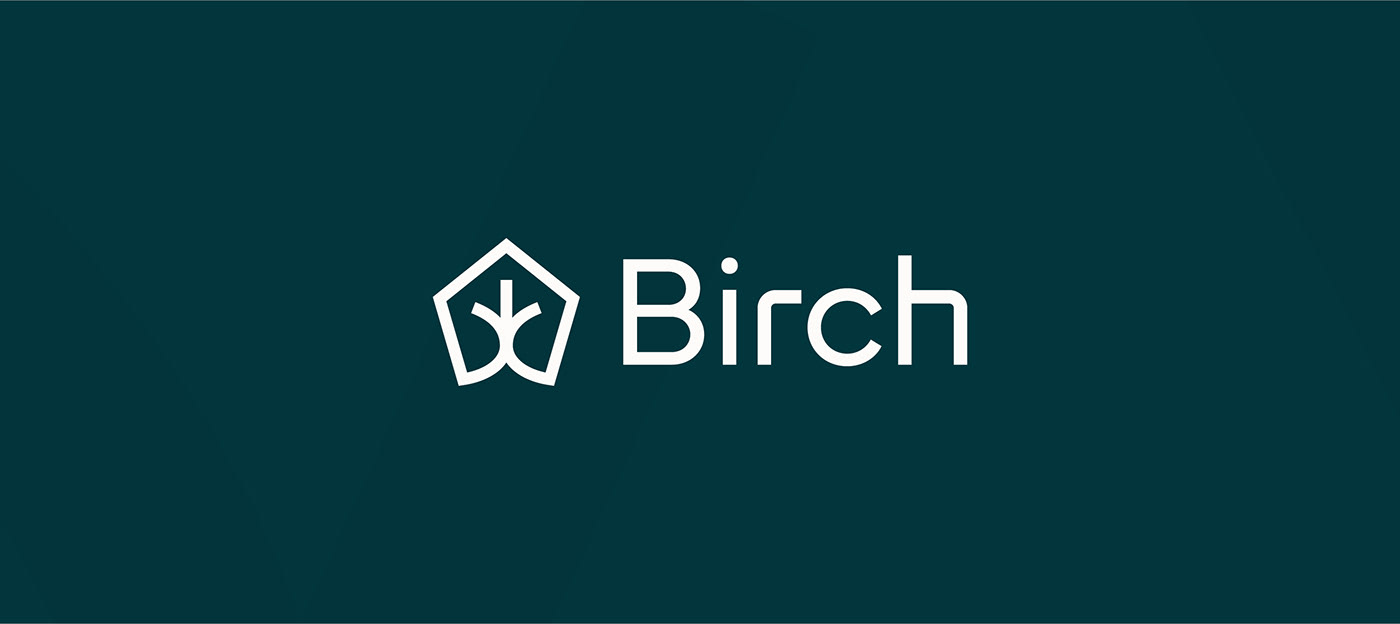
Before diving into idea generation, I always revisit the brief a few times keeping my eyes peeled for any nuggets of gold I may have missed - particularly nouns and adjectives. Some that jumped out to me were home, scent, diffuser, nature, birch, tree. I was buzzing with excitement to get sketching and immediately started playing with the idea of combining a couple of these words in a symbol. After getting the more obvious solutions out the way, I stumbled across this beautifully simple mark bringing together the home, a diffused scent and a tree.


After cementing this home/diffused scent/tree logomark as the primary direction, I needed to pair it with some type. A heavy lean towards the technological and innovative side of the business was present in the brief and I wondered if I could bring more of that in the logotype. Once I’d selected Mundial as the perfect typeface to find the middle ground between a premium feel and approachability, I decided to customise a couple of the letterforms.
And by customise, I mean completely redraw.
This may be a tricky concept to wrap your head around without me gesturing at you with my hands, so bear with me. When I think of the word digital, I think back to computer programming and coding which at its base, is made from 0’s and 1’s. If we translate that idea to an axis we get the x and y-axis. 0’s could represent the horizontal and 1’s could represent the vertical. With me? If we overlay this concept on to the logotype we could draw a vertical line and pair it with a horizontal line to create the R and H letterforms in Birch. This created a harsh corner where these lines met which felt a little too technological and edgy to me so I added a soft rounded corner instead - feeling a little more natural and pairing better with the rest of the letters and curves of the logomark. Tech 🤝 nature.
Logomark done. Logotype done. It was time to look into colours. The Birch team mentioned they would like the identity to feel calming, tranquil and neutral so I focussed on bringing these attributes to the design in the colour palette selection. Pairing some serene blue hues with a couple earthy off whites and greys really bolstered the natural angle to the identity and brought the whole design together.


Here’s some lovely words from one of the founders, Wyatt:
“In working with Jack, his ability to blend aesthetic appeal with deep brand understanding was something that really stood out. He thoroughly immersed himself in our brand's essence, resulting in designs that truly represent our message. No detail was overlooked in this process, and we have designs that are just as functional as they are beautiful. He's super friendly and doesn't bring any ego to the table, which makes the entire process a pleasure. We're excited about the fantastic results and our future collaboration with him on Birch.”